Quick Data Studio Tips: Sparklines, combined charts
Introduction
Let’s look at a couple quick ways to help make a Google Data Studio dashboard look as nice as possible. As in the post from late August, we’ll be working with Google Analytics data, but unlike that post these improvements don’t require any programming.
Update January 2019: Google Data Studio now supports sparklines directly! The Sparkline part of this guide shouldn’t be necessary any longer.
Sparklines
The sparkline is a famous miniature chart commonly found on dashboards and in reports.
These can be a nice supplement to numbers like Data Studio’s “scorecard”, since the sparkline can add context to a stat or metric without requiring more than a glance by some busy co-worker or executive. Data Studio does support time series charts, and in theory you just need a mini time series, but simply making a tiny chart isn’t sufficient — if you try making one, you’ll end up with something that looks messy.

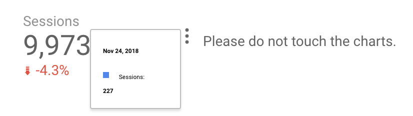
There’s a sparkline in here…somewhere…
Even if you know how to change the style of a chart so it can work at this size (we’ll go over that momentarily), you’ll still have an awkward mouseover effect.
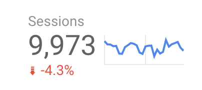
Fortunately, it’s not too hard to handle both the styling and the mouseover tooltip problem.
Styling for a Sparkline
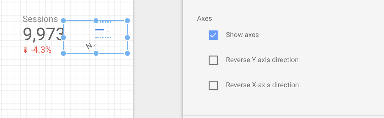
Basically, we need to remove everything from this mini-chart: the legend, the axes and gridlines, etc. All of this is easy to clear out from the “Style” area.
To begin, we don’t want axes, so uncheck “Show Axes”.
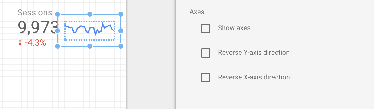
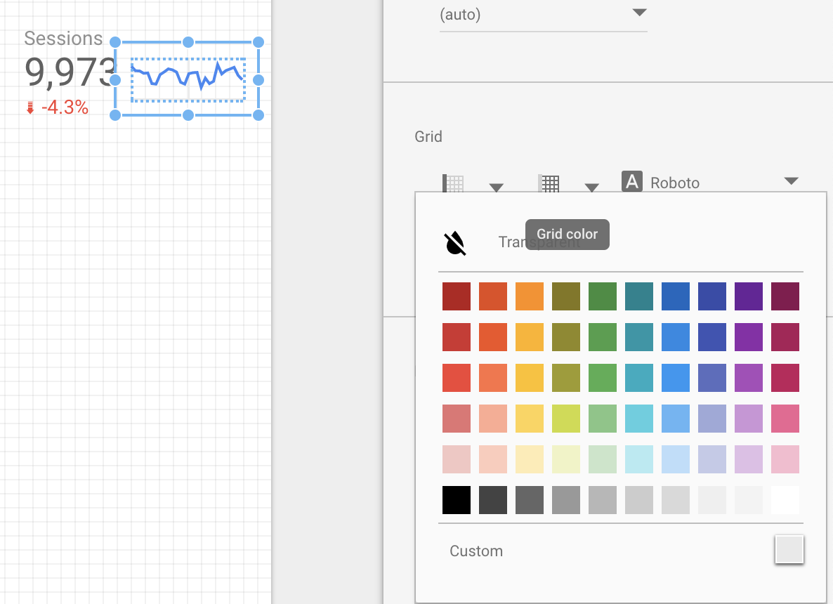
The improvement’s already obvious! But current version still has some minor grid lines when viewed — let’s get rid of those as well. This is also easily done through the “Styles” area — just scroll down to “Grid”. The second grid-like icon is the “Grid color” and that can easily be set to “Transparent”, the option at the top of the color menu.
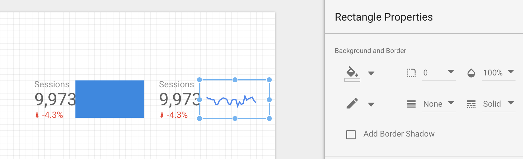
So far, so good — but we still have the problem that a user can mouse-over our sparkline and completely obscure it with an awkward tooltip. At the time of writing, Google hasn’t provided an option to disable tooltips (at least, that I’m aware of) but there’s an easy workaround. To start, look for the “Rectangle” option in the top bar of chart types, and drag out a rectangle that covers your sparkline area. Then, use the “Style” menu to change that rectangle’s background to be transparent. As long as the rectangle’s positioned in front of your sparkline, anyone mousing over it will be mousing over a static rectangle shape, not a chart, and that means no awkward tooltips!
Combining Breakdown Dimensions with Their Original Data
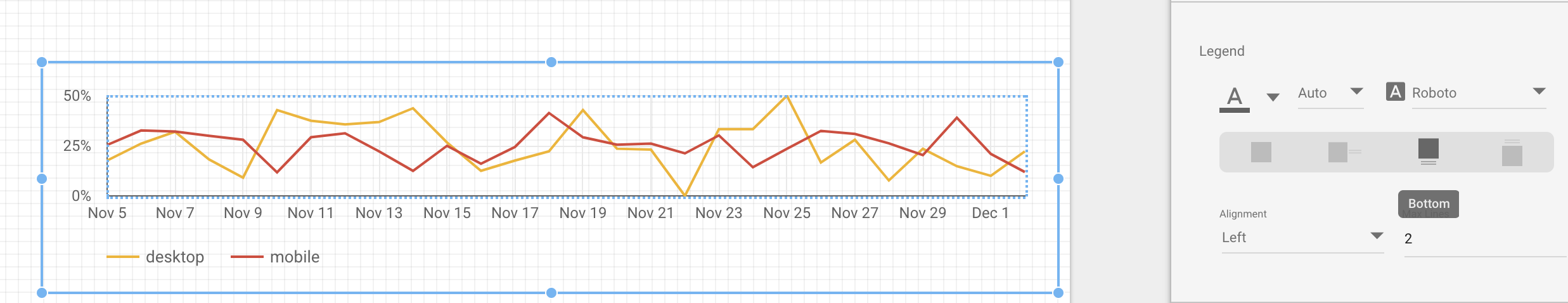
Another technique that can be useful is to show a piece of original data and its breakdown on a single chart. For instance, let’s say you want to look at the conversion rate for some web store, and so you’d like a time chart which shows:
What percent of visitors buy something
What percent of mobile-using visitors buy something
What percent of desktop-using visitors buy something
This could help show if there’s a problem with the mobile shopping experience. Unfortunately, while Data Studio does have a “Breakdown Dimension” option on time charts, there’s no option (when working with data from Google Analytics) to show both the broken-down data (2 and 3) and the original data (1) on a single chart.

Two charts that beat as one?
If you’re using data from a spreadsheet or something, it’s easy to have a “total” row, but Google Analytics doesn’t have much flexibility with its data. Even if we make two charts (like above) and use “Blend Data” to combine them, we’re not going to get a good result. But we’re not totally out of options, if we’re willing to use a bit of a workaround.
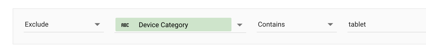
Step 0: Removing tablet data
In my experience, very few people use tablets with the products I work on. This can mean that a breakdown showing conversion rate by platform that includes tablets has a lot of 0% and 100% entries (since sometimes only one or two people visit from a tablet). I removed tablets from my analysis using a filter:
You might not want to do this if your data is cumulative — for instance, if you’re doing this with a count of sessions, where totalSessions = mobile + desktop + tablet, removing tablet-based sessions could make your data look suspicious to a careful viewer.
Step 1: Confirming chart format and scale
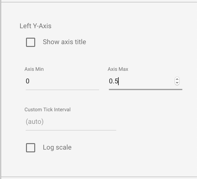
What we’re going to do, odd as it sounds, is physically overlay one of these charts on top of the other. To make this work, we’ve got to make sure the scale stays the same for both. Looking at my data here, it seems like typical conversion rate doesn’t get above 50%, so let’s lock the Y-axes of both charts to 0.5. (The decimal is because we’re dealing with percentages.)
If we overlap the charts now, the legends will overlap and be unreadable. To avoid this, let’s change the chart with the mobile/desktop breakdown to have a legend at the bottom. You could, instead, change the alignment to “right” instead of “left” — it’s all up to you.
As long as you’re styling, a couple small things to check: make sure that the second chart doesn’t use the blue color from the first chart. If you use a different color scheme, the same applies: don’t use the same color twice in one chart. Along with this, consider making the line weight for those breakdown lines set to 1 instead of 2. That’ll make it clear that the strong blue line is what should have the main focus.
Finally, we’ll remove the internal grid lines from the charts. The grid lines don’t line up perfectly, and whichever chart is in the back will be partly occluded by the front chart’s grid, so making them all transparent is a good call.
With the charts using a fixed Y-axis scale, no visible gridlines, and the legends all handled, we’re ready to overlap them. The legend change made here will make it a little tricky — we’ll just get as close as we can using the arrow keys to move the bottom chart, and then use Shift + arrow keys for precise movement.
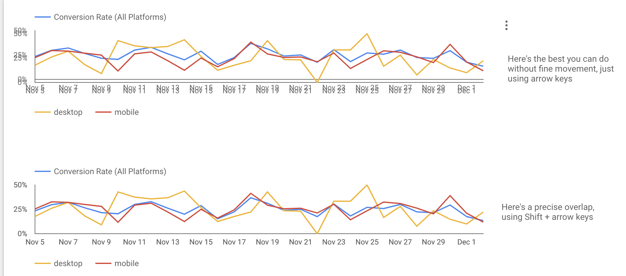
With that bottom chart, we’re just about good to go! The final step is just to decide what shows up when someone mouses over the chart. You’ve got three options:
The original conversion rate based on all data
The breakdown data: desktop and mobile conversion rates
Nothing
If you don’t want to deal with the mouseover, follow the sparkline instructions about a transparent rectangle over your data. Once that’s done you’ve got a combined chart!